


Datasparq had a problem. They'd grown up.
They'd transformed from tech startup into serious AI consultancy, but their brand was still wearing the same clothes from three years ago.
The issue wasn't just aesthetics. Their materials looked like they'd been made by 27 different people (they had). Executive clients weren't connecting and deals were slipping away.
So I rebuilt everything from the ground up.
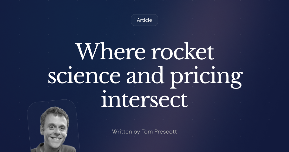
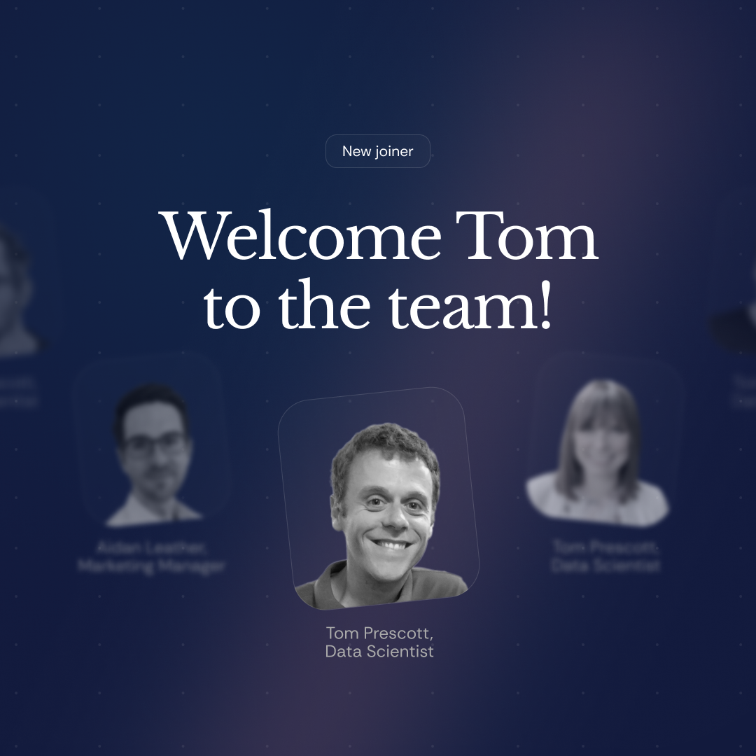
I crafted a complete design system around the concept of light emerging from depth—a visual metaphor for how they bring clarity to complex data problems.
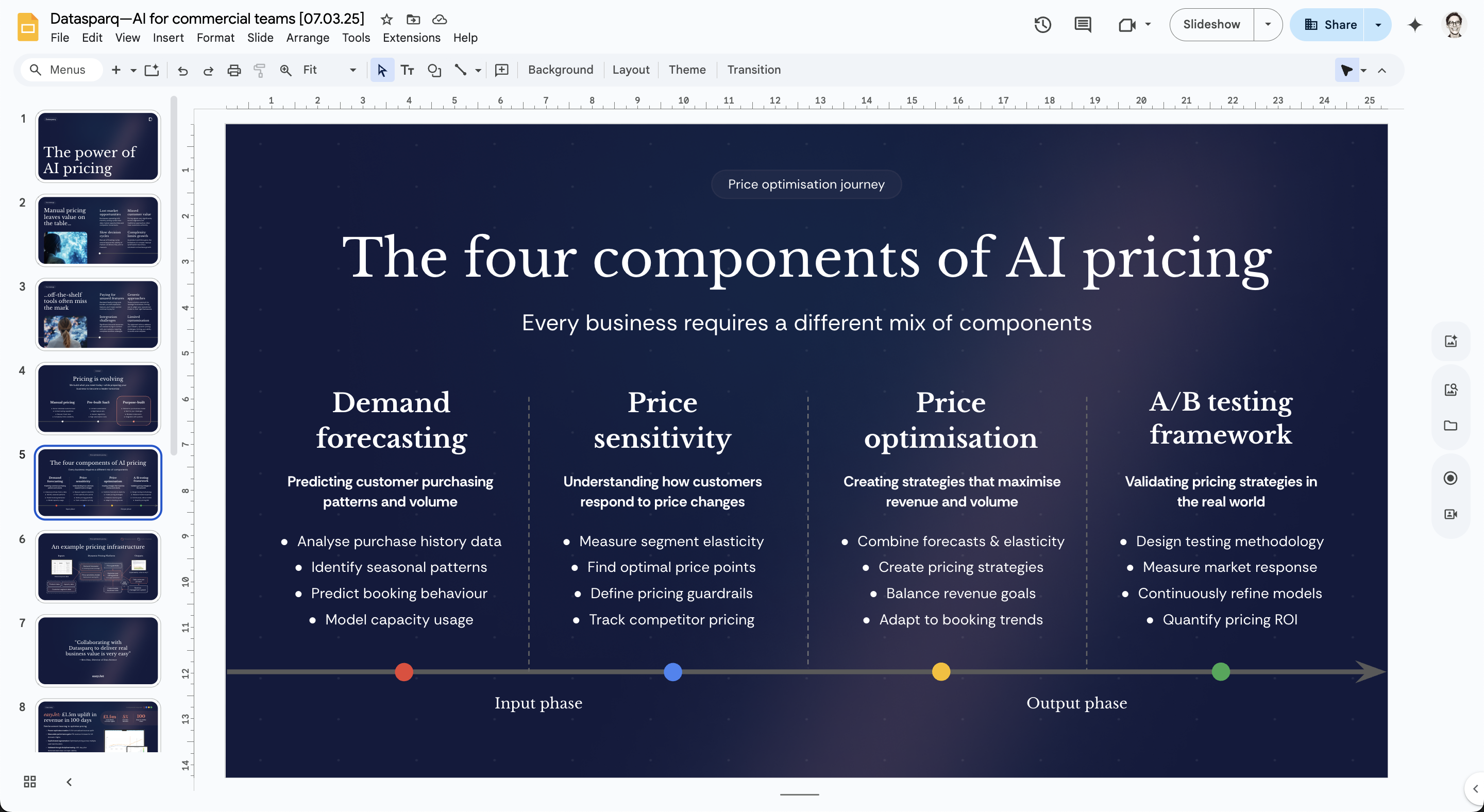
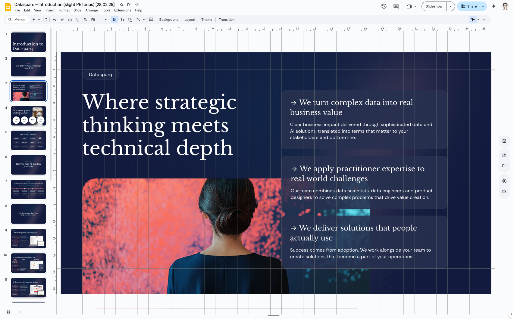
Created a new website in Webflow with carefully constructed component architecture.
Developed a custom slide system in Google Slides with locked master elements that still allowed flexibility.
Typography got a serious upgrade—swapping clunky Roboto for elegant Libre Baskerville paired with the clean lines of Sequel Sans. This created a perfect balance of authority and approachability.
I softened their rigid "spark" graphic into organic gradients that could adapt across applications. Standardised their visualisation approach for data, unifying colours and chart styles while still allowing for customisation.
The good stuff happened quickly:
- Inbound enquiries increased
- Executives stopped checking phones during presentations
- PE prospects started taking them a little more seriously
- Team members were genuinely proud to see their work reflected in more polished materials
- People were eager to use the new deck template
- Proposals started landing
- We received tonnes of compliments from prospects specifically about the materials
For the first time, they looked as smart as they actually were. The way they looked finally reflected the quality of what they delivered.
